What is a brand?
Before we jump into a discussion of style guides, it’s important to establish some terminology first. When our creative team talks about a “brand,” we are not referring to a logo by itself. A logo is one part of a brand, which, at a minimum, also includes a color palette and fonts/typographical elements. A robust brand might also include numerous logo options for different situations, a tagline, a particular “voice”, and a style of photography and/or graphics. All of these elements work together to help your audience identify your organization and connect with it.
But a brand, no matter how robust, is not effective at achieving that goal of identity and connection if it is not implemented properly. Following a style guide ensures that everyone who works with the brand––be they employees, volunteers, or contractors––is aware of the assets available and the guidelines to follow. Consistency is key to brand implementation.
What is a style guide?
A style guide can be as simple as one-page or be a dozen pages or more––it all depends on the complexity of the brand. For many of our educational clients, a single sheet quick reference accomplishes the purpose of the style guide and is easy to digest for the user.
Here’s an example of a simple guide we created for Centerville School District:
This basic brand guide shows the various logo options available (a good brand has several logo files for different usage requirements), the font family used for the brand, the color palette, and examples of how to properly use the logo and how not to use it.
In the following example for the much larger district, Fife Public Schools, all of the same elements are included in the style guide as in the one-page example above, but there is also more detail about the brand personality and driver. There are also different logo options and color schemes for different district programs.
Why use a style guide?
“Our brand colors are red and blue. Make our website red and blue.”
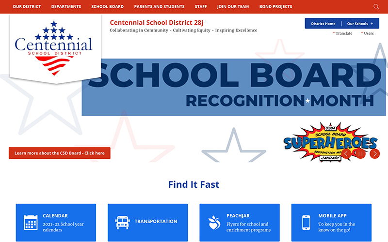
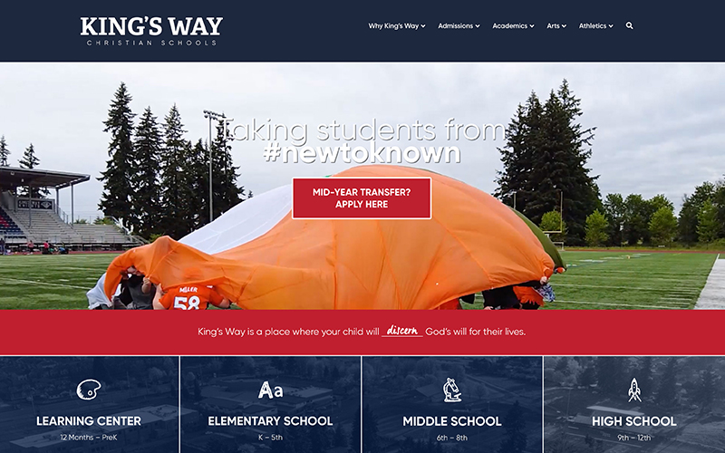
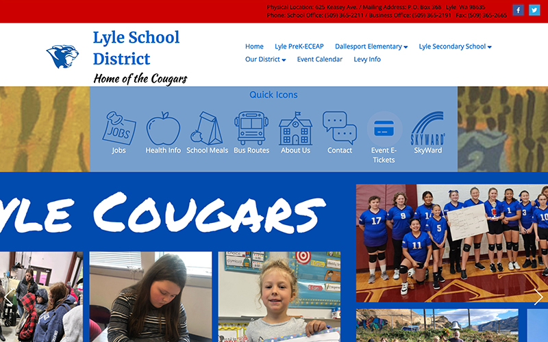
While someone might think they are being clear with the above color direction for a web designer, the outcome might surprise them. All of the websites shown below are “red and blue.”


As you can see, having a style guide for your brand is a great tool to keep everyone on the same page. It’s one thing to say, “Our colors are red and blue,” but unless you give exact color formulas, you may end up with signage, logowear, and marketing materials all with wildly different interpretations of your colors.
The same goes for fonts and logos. By having it officially spelled out in a style guide, you take the guesswork out of branding and get a more cohesive look across your organization.
Putting your style guide to use & staff training
There is a lot of information packed into a style guide, and it’s important to share it with your staff and contractors that work with your brand. It’s also crucial that you and your staff understand how to use the information. Part of a good brand implementation might include training for staff. Just an hour or so of training via Zoom a couple times a year can really help improve brand implementation and consistency. While we do train district staff how to use their style guide upon request, this series of articles will cover the basics of that training. Feel free to share these articles with your staff for their reference.


