NOTE: These tips do not replace the Web Content Accessibility Guidelines (WCAG) 2.1. Always refer to these guidelines and recommendations above anything else.
Accessibility Tools
There are many accessibility tools available, both free and paid. These are the ones that I frequently use when working on websites.
WAVE Evaluation Tool for Chrome
This allows me to do quick accessibility checks at the page level including ALT tags, color contrast and heading checks. For instructions on how to use this tool, go to the Web AIM website.
Chrome Browser Inspector Tool
This is a free tool that comes with the Chrome browser. This is helpful to check the backend website code to find headings and hex colors being used. Here is a video tutorial on how to use this tool.
Contrast Ratio Checker
Allows you to check the contrast between the text and background colors to ensure that it meets the WCAG standards.
Image ALT tags
Photos and graphics are a great way to add visual interest to a web page as well as help illustrate an idea. Unfortunately, they aren’t always useful for ALL users, especially for those that use assistive technology or screen readers. This is why it’s important to add descriptive text (also known as ALT text) to an image or graphic when it conveys important information.
Now what is the correct approach for adding ALT text?
There are many different viewpoints and not one official solution. My suggestion is to be consistent with how you choose to add ALT text across your website while meeting all aspects of the WCAG guidelines.
Quick Tips!
- Any image that links somewhere is required to have alternative text per WCAG Level AA standards (even if it’s considered decorative)
- Decorate images that do not convey content can be marked as decorative so that they are skipped by assistive technology (as long as they aren’t serving as a link)
- Use the WAVE tool to check if images are missing ALT text
Quick Tips!
- Reserve Heading 1 for the page title
- Outline page content with descriptive headers and use Heading 2, 3, etc.
- Do not skip heading levels (ie: H1, H2, H4)
- Use the WAVE tool to check proper heading order
Page Headings
Have you ever put together an outline or table of contents for a document? It essentially tells the reader what the main topics and subtopics are allowing the reader to skip to the section they want to read.
Web pages work the same way by using heading tags (ie: H1, H2, H3, etc). In addition to visually breaking up the content, this also allows assistive technology to get an overview of the content of the page so that the user can better decide which section they want to skip to or read. Typically, there is one heading 1 on a page (usually reserved for the page title). There can be multiple heading 2, 3, etc. depending on the content.
How do you know what headings are being used?
Usually when you are editing your page, there is a way to view the heading level or paragraph for each piece of text. Alternatively, you can view the tags in the backend HTML view with the chrome browser inspector tool or WAVE tool when viewing the page on the front end.
Check with your website administrator if you don’t know how to change your heading tags.
Color Contrast
Just as we are making sure that website content is accessible for blind users, we want to ensure that low-vision and color-blind users are also considered. According to WCAG , the minimum contrast ratio for text and images of text should be at least 4.5:1 (Level AA). Large-scale text and images of large-scale text should have a contrast ratio of at least 3:1. The only exception is text that is part of a logo or brand name – there is no minimum contrast requirement in this case.
How do you know what contrast your text is then?
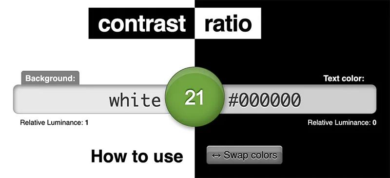
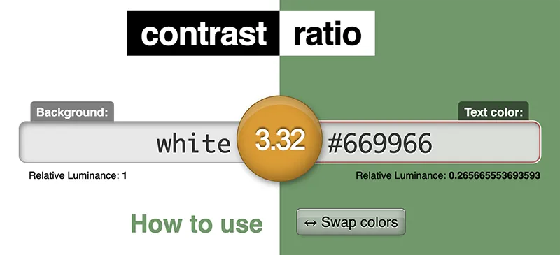
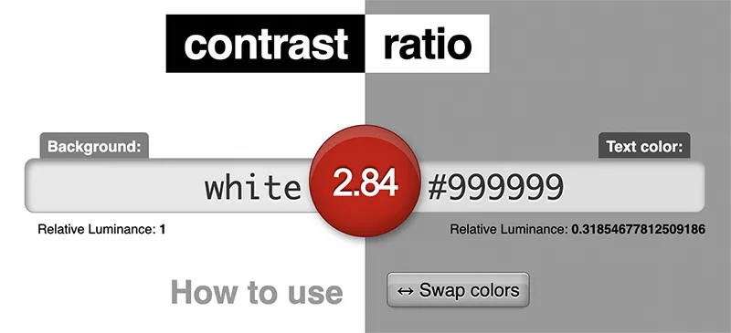
Use the chrome inspect tool to find the hex value of my text color and my background color and plug those into the Contrast Ratio Checker website. The green dot in the middle will tell me the ratio and if it passes or not.

Green indicates passing
Passes AAA level for any size text and AA for user interface components and graphical objects

Orange indicates only large text passes
Passes AA for large text (above 18pt or bold above 14pt) and AA for user interface components and graphical objects

Red indicates that it doesn’t pass
Fails WCAG 2.0 and 2.1
The WAVE tool will also flag any contrast issues on your page and allow you to find an alternative color that might work.
Video Text Captions
All videos posted on your website should have captions that are either always seen (part of the video) or that the user can turn on, when needed. The easiest way to do this is to host the video on YouTube and enable the auto captions. Read about how to do this on YouTube >
It’s always best to check these captions to ensure the content is accurate. In most cases, you’ll need to tweak and add punctuation.
Quick Tips!
- Automatic captions take time to process and may not be ready for a period of time after you upload a video
- Review captions for accuracy and make adjustments, as needed
PDF Document Accessibility
The most accessible way to display information on a website is with pure HTML (or plain text on a web page). In some cases, that’s not always possible and a PDF document makes more sense.
Some examples include:
- Fillable forms
- Documents that are meant to be downloaded and printed
But, as we’ve mentioned before, everyone loves a flyer! And, in many cases, your web editors may have uploaded them to your website. Unfortunately, the only way to check if a PDF is accessible is to download it and run the checker using Acrobat Pro (DC) which is the paid version of Acrobat Reader.
Link Targets
It’s best practice to open up a new tab/window whenever:
- You are linking to an external website
- You are linking to a PDF document
This allows the user to close that new tab and not lose track of where they were on your website. In order to do this, the link needs to have the “target=_blank” attribute added.
Alternatively, make sure any links to other pages on your website are NOT set to open up a new window. Sometimes it can get frustrating for the user if they end up with 10 tabs open on the same website.
Easy to Read
Last, but never least, you want to make sure that the content you’re putting on your website can be read by all audiences. This includes users with a variety of education levels, ages, languages spoken, etc. Here are a few things to keep in mind when writing content:
- Avoid wordy sentences and long paragraphs – get to the point!
- Break up the content with descriptive headers and smaller chunks
- Bulleted lists should be short and concise
- Ensure you have translated content, when available
It’s also a great idea to have someone else proof your content to make sure it’s understandable. So hit up your office mate for a quick look!
I wish there was a button
Me too…me too. Once you get the hang of doing these things on a regular basis, it will become second nature and a part of everything you do on the web. And ALL of your website visitors will be equally happy.


