Now don’t get me wrong: I love a good flyer. The flyer (or handout, poster, one-sheeter, take-away) is pretty much the mainstay of graphic design. In fact, it’s the bulk of what I designed at one of my first jobs working for my college bookstore. However, technology has come a long way since the late 90s when I was hanging up flyers for the latest book sale around campus. The 8-1/2×11 flyer has been losing its effectiveness as a marketing tool for the past decade, but that gradual transition to digital was given a huge push forward when COVID hit, and everything went remote.
Now that students are back in schools and (some) workers are back in the office, the flyer has its place once again, but I still think we need to take a hard look at how we are marketing and when the flyer should be an email instead.
When it should be a flyer:
- When you are going to print them—either to hang up somewhere or hand out (or send home in backpacks)
- When your audience might not be online
When it should be an email:
- When you are planning to email it! (Please don’t attach PDF flyers to mass emails or place a flyer image in the body of your email. I’m begging you.)
- When you want to know how many people are reading it
- When you want people to be able to take action (click a link)
- When your audience is a digital one
Let’s just address that bold bullet up there because it’s really the heart of the matter. If you are going to be emailing your content to a list (or posting it online for that matter), you should not be using a flyer. No matter what the file format (PDF, JPG, Google Doc), a flyer designed for print is not responsive, and thus will not be readable across a wide variety of platforms. You may be designing the flyer on a computer, but the bulk of your audience is reading your email on their phones!
A tale of two emails
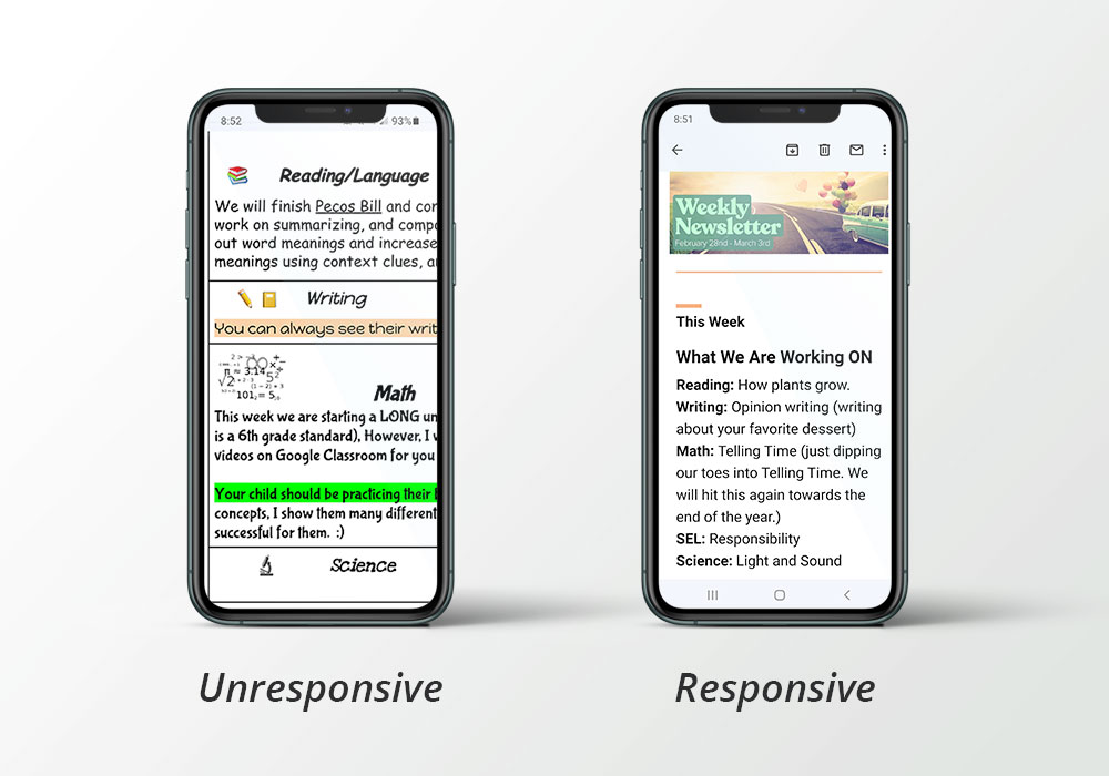
Here’s a real-world example of what I’m talking about: My fourth grader’s teacher sends weekly classroom newsletters by way of sending a link to a Google doc that is designed in horizontal layout with various boxes and pictures—like the typical classroom newsletter (also with about 50 different fonts used, but that’s a different issue). When I check my email on my phone while making the kids dinner (because who has time to check personal email on their computer?), I have to login to Google when clicking the link, and then I’m presented with a super wide document that will not scale smaller and will not rotate. I have to move my finger back and forth on every line to read the whole thing, or (as generally happens) just read the leftmost two inches and try to get the gist. By contrast, my first grader’s teacher sends weekly emails through an email program (in this case, Smore). This email fits itself to the screen size and orientation of my phone, I can adjust the size of the text, and I can even download the pictures of my kid that might be included. Can you guess which classroom newsletter I read faithfully each week?

The importance of responsive content
The difference I described between the two classroom newsletters I receive in my inbox each week is what is referred to in the industry as responsiveness. The first-grade teacher’s newsletter is responsive; the fourth-grade teacher’s is unresponsive. And when communications are unresponsive, it’s time to perform marketing CPR! (Okay, okay, so the technical term might not be unresponsive in this case, but it should be, and the metaphor works, so I’m running with it.)
Responsiveness is important for websites too—not just emails. Basically, any content in the digital world should be flexible and adapt to the device reading it. Just as you shouldn’t insert an email of a flyer into your email, you shouldn’t insert a flyer image on a web page either. That content should be live and responsive.
You want your content to be read (otherwise why create it?), so you want your content to be responsive. You don’t know what device your audience might be using, but a responsive website or email program does, and it will adjust itself to meet your audience where it is. What’s more, content in a website or email program is accessible, which means people using assistive technology can have it read to them with their screen reader or adjust the font size or contrast.
Don’t know if your email or website is responsive? That’s easy: Just open it on your phone. You’ll be able to see right away whether it’s time to find the nearest AED (Assistive Educated Designer).
What if I want to print my content AND email it?
I’ve had several clients ask for just a flyer because they want to do it all: print and digital. My response is: You should do both. Yes, design a pretty flyer to print and distribute, but also convert it to email or web form.
Do your email recipients also need to be able to print your flyer? No problem: Send the link to the flyer in the nicely designed email that also has the same content. A flyer emailed out as an attachment is not going to “kill two birds with one stone”—it might just kill your marketing efforts because no one opens the attachment.
What email program should I use?
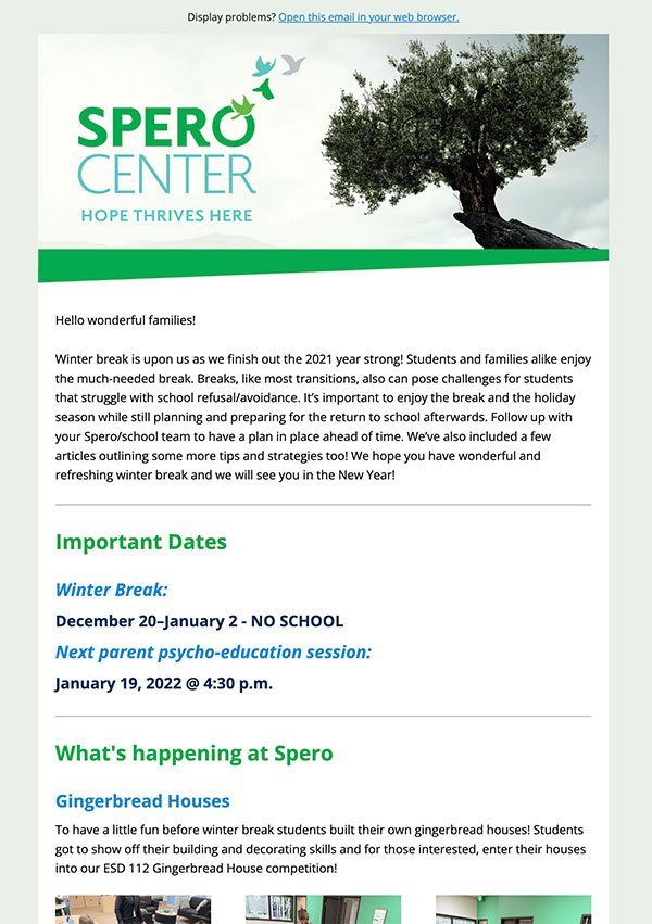
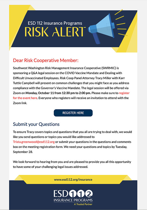
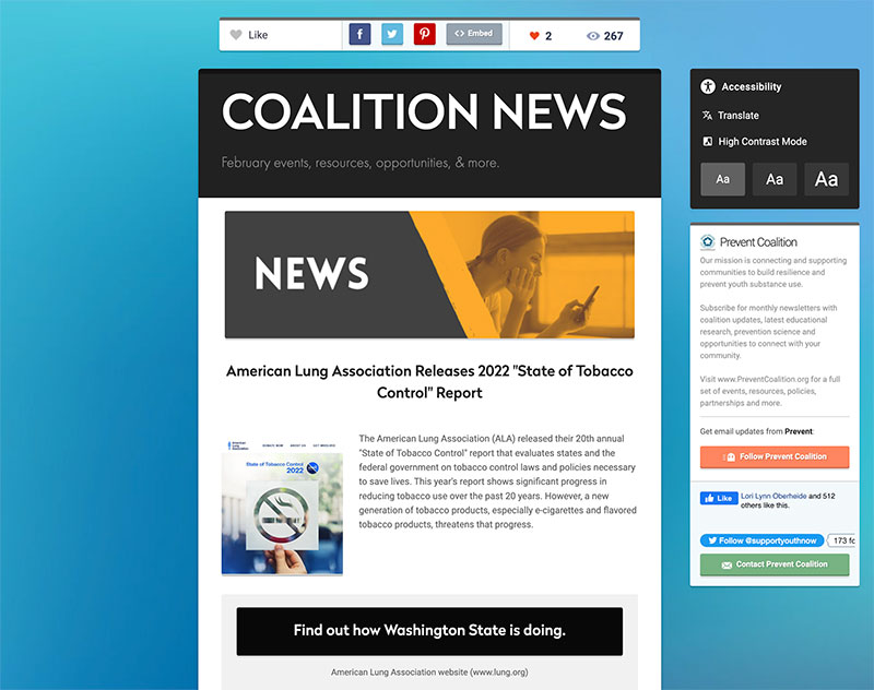
On the ESD 112 website and this website, we use a plugin called Mail Poet. It works really well with the WordPress platform and makes integrating our site posts with our emails super simple. We just drag and drop blog posts into the newsletter template and send it out. We can also layout emails directly, even if we don’t want them integrated with our website’s news.
There are also a ton of email programs out there. I mentioned Smore, which lots of educators love. There’s also Mail Chimp, Constant Contact, and many, many more. Even Microsoft Office 365 has an email program called Sway, and Gmail has templates. We have helped several clients design a newsletter template for whatever program they are using and import their mailing lists.
The beauty of using a mail program or plugin is that your emails are beautiful, responsive, easy-to-create, and kosher. That is, they follow the rules of not spamming people by including subscribe and unsubscribe links, which help you keep your mailing list up to date. You can also get statistics from your emails (depending on the program you use) and see how many people opened it, who opened it, what links people clicked, and more. That data can be extremely useful!
To sum up: Flyers are an essential communications tool, and they’re certainly not going away, however make sure that you aren’t just defaulting to flyers because that’s your go-to. For any marketing or communications effort, it’s important to consider the goals and the audience. Upon introspection, you will probably find that it’s time to convert a lot of those flyers to email to truly make your efforts worthwhile.


