You just completed a big branding project for Yakima School District. What was the project?
One of Yakima’s middle schools, Washington Middle School (WAMS), had recently voted to change their school mascot away from the “Colonials” because they felt it did not represent them. It was a student-led initiative that started with a petition and took many years. The leadership team was excited to create a new mascot and logo that the students could be really proud of. They voted to become the Lions, and that’s when the district’s Chief Communications Officer, Kirsten, contacted me.
Often when a school chooses a new mascot (or it’s a new school) a student or member of the staff draws the mascot. Was that the case with WAMS?
No, they didn’t have a mascot from a school artist. They had used some stock art for people to vote on the choices, so they provided that as a starting point for what they were looking for. I then pulled some more stock art examples to show the school leadership team and the district superintendent, so we could explore a wide variety of different styles and nail down their vision.
Do you work on branding projects a lot, or was this something new for you?
In my career I’ve done many branding projects and designed logos, but those have mainly been for school districts (or in the private sector before I worked at ESD 112). This was the first time I had ever designed a school mascot with the logo–unless you count the time when I was about 12 and my pencil drawing of a river otter won the contest for the new school mascot in my hometown.
Projects of this nature tend to be highly collaborative. Who did you collaborate with, and what was that process like?
It was a very collaborative process with the WAMS leadership team and Yakima’s Superintendent. Since I am in Ridgefield, and they are all in Yakima, I used a series of Google forms to tease out likes and dislikes. Mascot artwork styles are highly subjective, and not everyone uses the same language to describe things. It was important to get a sense from them of what they wanted to convey with the mascot (i.e. fierce vs. regal), and also to show concrete examples that they could comment on to help eliminate misunderstandings with language. Stock art was extremely helpful for this aspect of the project. Instead of me spending countless hours sketching lions (something that is not my strong suit), I could show them a wide variety and narrow the style down fairly quickly.
Aside from the forms, I jumped on a call with the Superintendent, Trevor, and Kirsten, who was project-managing, to talk through some of Trevor’s suggestions. He had some great ideas for the lion. It was actually Trevor’s idea to hide a W in the lion’s mane.
What was your favorite aspect of this project?
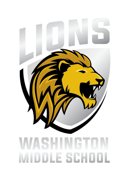
The hidden ‘W’ was definitely my most favorite part of this project. (I wish I could take credit for that brilliant idea!) It wasn’t without challenge though: When I was trying to draw it into the mane, I kept accidentally making it into an ‘M’ instead! It was like I had forgotten what a ‘W’ looked like! I ended up typing a big ‘W’ and placing it right next to my illustration while I drew. That did the trick! Then it was getting it to be there, but not too obvious. There was some back-and-forth on that, but I think we landed in a great place.


It looks as though there are actually several mascot and logo designs that came out of the branding process. How did that come about?
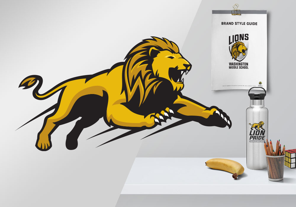
Well, when I was pulling stock art examples, I found one that had the lion head in the shield and a full body version of the lion. The WAMS leadership team liked the idea of having different options for different uses. And then later, the Superintendent suggested the lion body being more active, which led me to the jumping lion. We ended up liking all three options, so rather than narrowing it down, we just distinguished them for different uses. The head in the shield version is for the main school logo, the jumping lion is only used for athletics, and the standing lion is used for school programs and extracurriculars.
It can be tempting to want to just narrow a logo down to one option and say, “This is the logo. Period.” But I’ve learned from our Creative Director, Heidi, that it’s okay to embrace flexibility and multiple options. It actually can make a logo more usable in a wide variety of situations
Branding is just one step in a lengthy process. What comes next for Washington Middle School?
The WAMS Assistant Principal, Nick, is heading up the brand launch with students and families, and he is doing a great job planning the rollout. They have taken their branding guide and logos and are running with them! I know that muralists and printers are busy at work transforming the school. They are doing a soft launch for the end of the school year, and then next school year the brand will be completely incorporated. Nick has created a short unveiling video that was shared on their Facebook page which explains the branding process and the vision behind it. They’ve also created new PBIS posters and slogans around the lion theme using the PRIDE acronym (Positive, Responsible, Inclusive, Determined, Engaged), which I absolutely love. I’m excited for their students and staff and can’t wait to see the brand fully implemented!
What clients are saying
Melissa works with a variety of district clients from across the state as well as many internal programs and departments. Read about what some of them have to say about working with her!
“This is stunningly amazing. I’m always in awe of what you’re able to do with the unorganized rough ideas! I love the overall look and the layout.“
“This is so, so fantastic. It actually brought a tear to my eye. It is just such an effective design. I really appreciate your gift for taking something wonky and totally undefined and turning into something accessible and lovely.”


