Why use Canva?
Canva is a great tool for those with limited budgets who can’t afford Adobe Creative Suite. It is also very user-friendly, making it easy for just about anyone to jump in feet first and start designing. The tool offers hundreds of design templates to use as a jumping off point, which can be great for those who are intimidated by that empty page. You can also create templates and “Brand Kits” for others to use, making it easier for those making designs to stay on-brand.
Canva offers a free plan for people to give it a try, but if you’re thinking about using Canva for the long term, I highly recommend paying for the Pro version. At only $120 or so per year for five people, it’s a great deal. The best news? Canva allows teachers and students to access Pro-level tools and templates for free.
The Pros:
- Very affordable
- Quick & easy
- Built-in & custom templates
- Great for collaboration
- Brand kit
When not to use Canva?
Canva is a great resource for quick and simple design, but it definitely can’t replace professional design software or the services of a graphic designer. The very fact that it’s simple and easy to use means that it doesn’t have many of the tools used in more complex documents. For example, Canva doesn’t allow you to design layouts with columns, wrap text around objects, include special characters or glyphs, layout tables, or even use two different fonts within the same text box. This means that any text-heavy document will get pretty cumbersome pretty quickly in Canva.
Similarly, Canva does not have illustration tools. You can’t just draw your own shape or line freestyle, like you can in Adobe programs. You can upload them as images you bring in, but if you have the software to create them, why are you using Canva for layout? Canva is not for infographics or designs that have a lot of custom graphics or icons. Canva’s simple interface also makes it hard to find certain functions that it does have sometimes. (I’ve included a tip for one such function below.)
Another downside of Canva can be the very thing that it is great for: built-in design templates. Canva really likes to push its design templates, and it is constantly flying out a sidebar full of them at every turn. It can get pretty annoying, and there doesn’t seem to be a way to turn them off or limit them. This means that you can very easily find yourself dealing with lots of “rogue” designs from non-designers who mean well and completely take your organization off-brand into the design wilderness. You can head off rogue designs by ensuring the your brand kits are robust and you provide custom templates, but you will probably still find yourself trying to rein them in.
The Cons:
- Very limited text tools
- No illustration/drawing tools
- Easy to get off-brand with templates
- Can be hard to find certain functions
Pro Tip: How to place a photo inside a shape
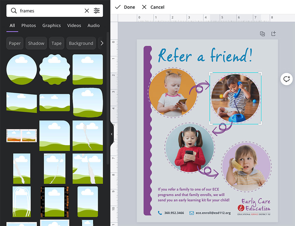
I started using Canva with our Early Care & Education department because they have a lot of flyers that they like to be able to edit and publish frequently. The first road block I ran into with my designs was that I couldn’t figure out how to get the photos I was using into a circle shape. You can’t just drag a photo over the circle shape! After some Googling, I learned that Canva has a separate category of objects called “Frames” that are different than “Shapes”. They are easy to identify by their image of a cartoon landscape inside a shape. If you search for “frames” they will pop up right away, as shown below. After that, it’s a piece of cake.
How to do it:
- Search for “frames.”
- Drag the frame shape you want to your canvas.
- Drag the photo you want inside on top of the frame.
- Double click the photo to move it around within the frame and change the cropping.

Pitfall to Avoid
Canva has a feature that lets you resize any design automatically. Pretty cool, right? It can be, but just be careful when going to a smaller size. Your text might end up microscopic! Even if you aren’t resizing, it can be easy to make your text too small in Canva. The program automatically fills the window with your page, which is great, except on smaller pieces it means that it is zooming in to do so, and you might not realize it. Pay close attention to your zoom level and font size! If your font is smaller than 10 points, it will be difficult for anyone over 40 to read. If your font is smaller than 6 points, only someone with a magnifying glass can read it.
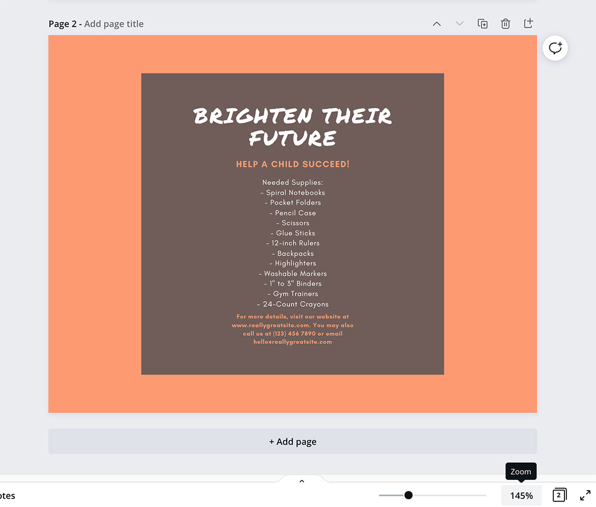
Here’s an example of a Canva flyer template that I converted to postcard size:
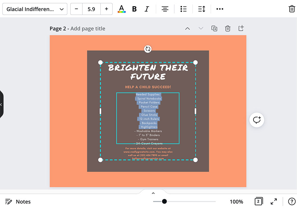
Looks a little small, but readable. Wait, take a look at the zoom level in the lower right corner. It’s zoomed in to 145%. Adjust it to 100%, and it looks like this:
When I highlight the text, it shows me in the upper left that my point size is 5.9. This is much too small to be readable. You would need to rethink your document size or reduce the amount of text for this design to make sense.
Remember:
Check the font size and zoom level! A design isn’t effective if it’s not readable by human eyes.


