
The Challenge
Prevent Coalition had a landing page for their Secure Your Cannabis campaign, which targets retailers, community partners and parents in the effort to prevent marijuana use by youth. In the beginning, the page started out small with just a few images and links. Over the years, the page has grown considerably to become a hub for resources in addition to the campaign materials. Prevent asked for my help to clean up the page and make it more user friendly.
Challenge accepted.

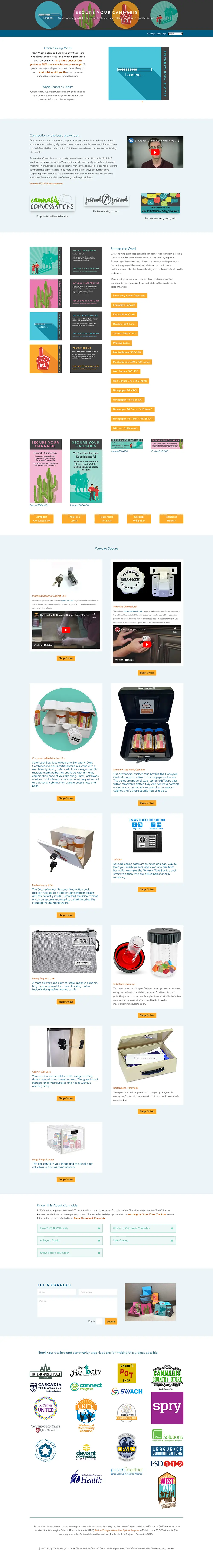
Click image to view the original landing page
Planning is key!
First, I took an inventory of the type of content on the page and created an outline:
- Campaign overview
- Prevention resources
- Campaign materials
- Ways to secure
- Cannabis facts
- Contact form
- Partners
From there, I adjusted the outline and order of content to better tell the story for the user. I also decided that the page was so full, it really needed a way for the user to navigate around rather than just scrolling. Adding a navigation bar to the top of the page was my solution. I organized the above topics into the following links:
- About
- Campaign Materials
- Ways to Secure
- Facts & Resources
- Partners
- Contact Us
Since the page was about the campaign, I wanted to ensure those materials were closer to the top instead of buried down below. Adding these navigation links (which just anchor down to the section on the page) provides the user with an overview of what to expect on the page and an opportunity to navigate to what they want right away.
In planning out the content organization, I went one step further and drew out what I was envisioning for the page layout. This helped me build the page faster as I wasn’t making as many decisions while I was developing the page.

Wireframes don’t have to be fancy or precise. I scribbled this on a scrap piece of paper so that I could visualize the page better.
Executing the plan
With a solid plan in place, the building went quickly. In addition to the new navigation at the top of the page, I also wanted to minimize the vertical scrolling as much as possible. To do this, I implemented the following functionality on the page:
- Used flip boxes to show the front and back of the campaign cards
- Organized the campaign downloads & resources into four different lists instead of a separate button for each
- Reduced the image sizes and added a third column for the ways to secure cannabis
- Put the partner logos into a sliding carousel
- Condensed the footer copy into a bar
Additionally, I added buttons to content areas that link to various related content on the page. This was another way for users to easily get to the content they were looking for.
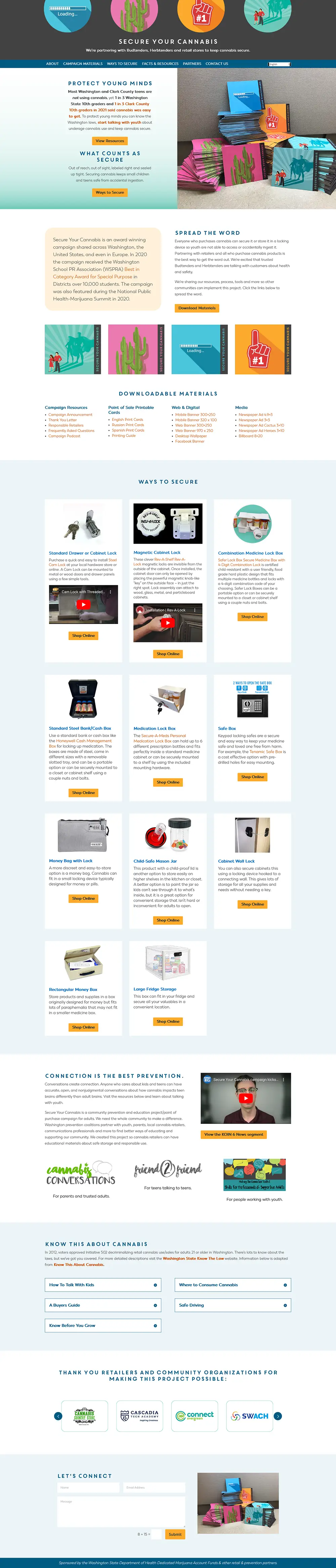
Click image to view the revised landing page
The end results
Overall, the redesigned web page is much shorter and digestible than the original page. The user experience has been improved considerably and the framework is now in place should more campaign materials need to be added in the future. And the client is extra happy…
Need help with a high traffic page on your website?
We can get you organized! Contact us today!