What’s the big deal?
Well, the bigger the images, the longer they take to download and the more space they take up. When you have unlimited server space and a fast internet connection, it might not matter much. But not all of your website users may have access to that same lightening fast connection that you do. And at some point your hosting provider might start nagging you to pay for more storage space. And nobody likes a nag.
What’s the best size?
In my many (many) years of building websites, I’ve found a pretty good balance between image quality and optimization resulting in a small file size that still displays nicely. And thankfully there is a little more give now that we don’t have to “dial up” the web. If you have no idea what I’m referring to, just be happy.

Full screen width images
I tend to make images 1800 pixels wide. These images are usually a bit bigger (300-400kb) than I’d normally recommend, but they tend to be used sparingly on websites making them worthwhile.
Blog posts (Featured images)
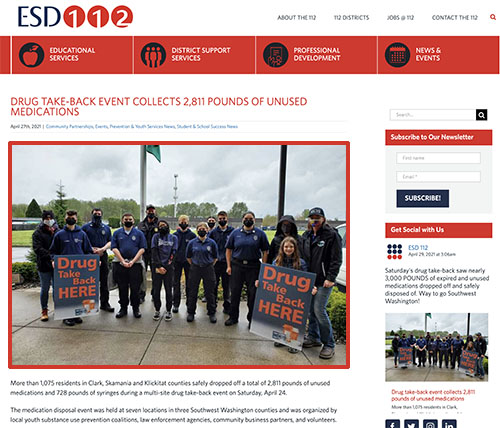
I recommend sizing as closely to the size the images displays on a browser. For example on our ESD Newsroom, I size all of our images to be 1050 pixels wide by 700 pixels tall. If you’re only using your blog images as thumbnails, they can be sized smaller.
In content images and logos
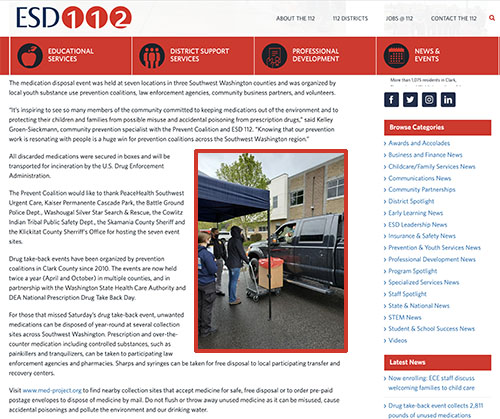
It really depends on how the images are being used but 500 – 800 pixels wide is usually plenty. Especially if the images are being scaled down for desktop use.

Full screen width images
I tend to make images 1800 pixels wide. These images are usually a bit bigger (300-400kb) than I’d normally recommend, but they tend to be used sparingly on websites making them worthwhile.
Blog posts (Featured images)
I recommend sizing as closely to the size the images displays on a browser. For example on our ESD Newsroom, I size all of our images to be 1050 pixels wide by 700 pixels tall. If you’re only using your blog images as thumbnails, they can be sized smaller.


In content images and logos
It really depends on how the images are being used but 500 – 800 pixels wide is usually plenty. Especially if the images are being scaled down for desktop use.
NOTE: In all of the above cases, make sure that the image is sized at 72dpi if using another tool or program.
JPG or PNG?

Example image saved as PNG
I love the quality of a PNG file. It’s usually pretty crisp without any pixelation. That said, the file sizes are triple the size of an optimized JPEG. There are only two occasions that I save files as PNGs for the web:
- Logos with transparent backgrounds: JPGS automatically flatten the background so you cannot save anything with a transparency. Using a PNG allows you to keep the transparency so that you can put the logo on any background color and not have a dreaded “white box” around it.
- Line art/text graphics: Non-photos with text and flat colors will save better as PNG files while maintaining a small file size. JPGs will still be smaller but sometimes you can see pixilation in the solid colors. You can always save a file both ways to check which looks better.
For everything else, I save it as a JPG.
How to optimize
Now that you know the size and type of file to save, I guess I should probably tell you how to do that. If you have photoshop, Google has 1,001 ways to resize and save an image. But for the many website editors who don’t design things all day long like me, there are lots of free tools online.
So I went ahead and googled “free image optimizer tools” just for you! I found a pretty simple online tool that does what you need it to do called, wait for it… Resize Photos. It’s a pretty straight-forward process:
- Upload photo you want to resize
- Set new width (see above suggestions)
- Set quality – I recommend 70% – 80% quality.
- Set file export type (see above suggestions)
Once you click the upload button, additional effects become available should you want to play around or just simply download and move on your merry way!

